KET
Years ago

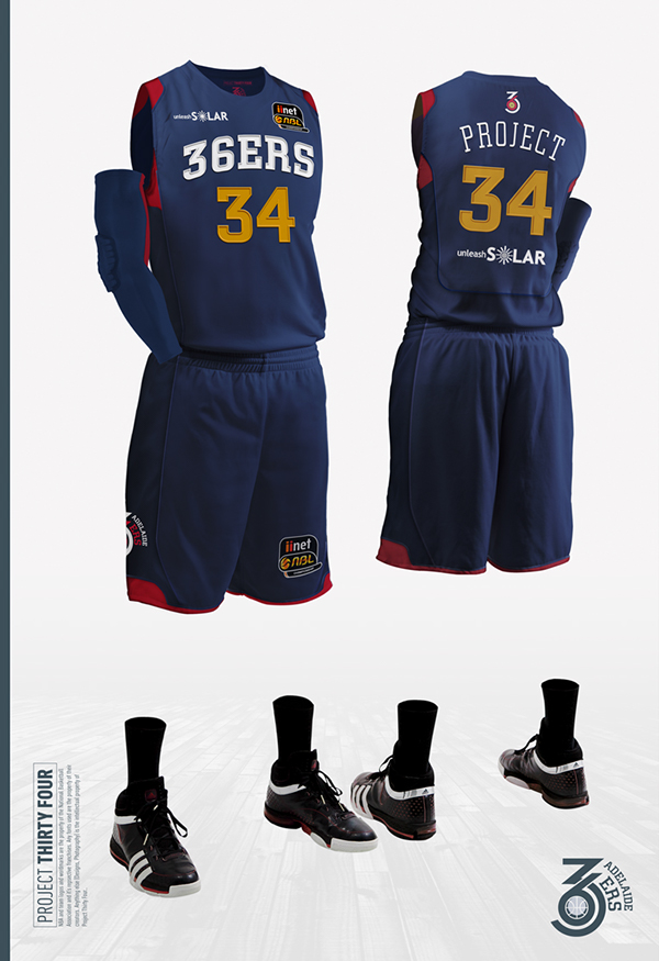
It's time to talk about the 36ers brand

This is my opinion etc. etc.

I know it's subject of jabs every now and then, and there may be arguments of other priorities for Adelaide to deal with....

...but let's be honest here. The 36ers logo and font they use is just bad. It's not even a "this will grow on you", it's just out-right cringe worthy.

The all-capital bold font used for the social graphics i'm also not a fan of, makes it feel like we're being screamed at.

What they had before was significantly better. I understand they probably changed it because of change of management, but it is about time the 36ers went to a graphics designer and fixed it. Same applies to the Adelaide Lightning logo, it's no better.

Branding is incredibly important.

Here's a few questions for hoops folks.

1. Am I being dramatic or is this a legitimate point?
2. Do you believe Adelaide will persist with the current design for the medium term?
3. Do you think the logo/front/branding should be changed asap?
4. What kind of alternate design would you prefer?
5. Do we look at an ode to the past if we did re-design?
6. What should the 36ers keep in mind if they do attempt a re-brand?

For what it's worth, I wouldn't mind the logo simply being this:


Topic #39845 | Report this topic


Isaac  
Years ago

No, I agree that it's really poor. The graphics and merchandise just end up looking cheap, and all the social media images follow suit. I think they should at least experiment with demoting one of either red or yellow to simplify things. And stop acting like there is zero marketing strategy and it's all completely reactive.

The sport and club are competing against heavyweight alternatives who have much more polished branding and I can only imagine how undecided prospective fans react to something looking much less professional than what they see from AFL, Big Bash, etc.

I've said many times that I think LK's design arm have done a great job with the NBL improvements and presumably they also handle Melbourne and Brisbane. I'd at least be seeing how they could help. If they're too expensive, there are loads of local graphic designers who wouldn't stand for what's being put out now.

Reply #597215 | Report this post


Ricky  
Years ago

Still feeling this guy's work.

https://www.behance.net/projectthirtyfour

Reply #597217 | Report this post


Ricky  
Years ago

Woops.

Reply #597218 | Report this post


ME (he/kangaroo)  
Years ago


1. Am I being dramatic or is this a legitimate point?

It's a legitimate point. The logo and uniforms have to be appealing and they haven't been for the past 10 years at least. Thankfully I have been advised that the uniforms the team wore in Darwin will not be the official uniforms and the same is true for the uniforms we've seen thus far in Brisbane.

As for logo, scrap it. It is ugly as shit.


2. Do you believe Adelaide will persist with the current design for the medium term?

They probably will persist with the current logo. I think if there were another one we would have seen it by now.


3. Do you think the logo/front/branding should be changed asap?

Yes. The uniforms are set to be updated but I think we will have to keep seeing that second-rate logo.


4. What kind of alternate design would you prefer?

Anything

5. Do we look at an ode to the past if we did re-design?

Yes

6. What should the 36ers keep in mind if they do attempt a re-brand?

Simplicity is key but actually put money into a decent designer.

Reply #597220 | Report this post


Tom  
Years ago

You're not being dramatic at all. The 36ers really need to repackage their whole branding including jerseys. The current logo is of high school media class quality and this is the first thing that needs to be changed.

Ricky, that guy should definitely be contacted by the club. Fans with that kind of talent shouldn't be wasted. My profile pic on here is his version if the 36ers logo :)

Reply #597223 | Report this post


Benno  
Years ago

@tom Love that logo!

Reply #597224 | Report this post


Ricky  
Years ago

The NBL needs him in general.. fresh and with some tweaks to include proper logos and the sponsors, would look very pro.

They remind me of NCAA jerseys, which I love.

Not feeling the new Bullets jersey they're gonna use to be honest, could've done a lot better.

Reply #597225 | Report this post


Anonymous  
Years ago

PLayers are taking all the money not enough left in the tank to rebrand.

Reply #597239 | Report this post


Speed44  
Years ago

Project Thirty Four needs to be employed by the NBL as a whole. Some of his designs used by some state league sides (in various states), his NBL rebranding versions and even his NBA rebranding versions are all really good or in most cases, great.

Why he hasn't been at least talked to and asked to submit designs, I truly don't understand.

Reply #597242 | Report this post


Anonymous  
Years ago

I figured it was just common knowledge the 36ers uniforms and logos were painfully boring.

Reply #597243 | Report this post


ROFLcopter  
Years ago

36ers stink.

Mosquito fleet for 2017 is a lock.

Reply #597244 | Report this post


Anonymous  
Years ago

While it would be nice to have a change, this is a discretionary cosmetic item.

Whats the #1 and #2 thing I want from the Sixers?

Firstly that they put together a competitive team on the floor that will CONTEND. So far that is looking good.

Secondly that the club does so with long term financial sustainability in mind.

Frankly, if we are winning, I wouldn't care if they were wearing white bonds singlets with flaking iron on numbers we see in socials. Winning is what brings people to the games, not singlets.

Reply #597245 | Report this post


Ricey  
Years ago

Anon, bad branding = no merchandise sales = less income = less spending power = lower quality team = less wins = less happy you. You can't have one and not the other. Doesn't work very well or in the long term, nor does changing the uniforms every 1-2 seasons.

It doesn't cost much to do good videos to promote the club or get good artwork for the branding. The 36ers have always had plenty of contacts they could use, but never dug deep enough, if at all. It's a shame, because so many talented individuals are among the 36ers faithful who would do the necessary work for cheaper and better than past people they've paid big for, partly out of love and also some decent season tickets to go along with the pay cheque.

Reply #597266 | Report this post


Tom  
Years ago

These are some things that I think would make the jerseys not only look better but also sell more.

1. Make them very SA centric without ripping off the Crows.
Keeping the royal blue is a must as is the white numbers but a sharp red and yellow stripe down the side of the jersey would look great and very recognizable to SA people.

2. Don't sell the jersey with sponsors on it.
This has been a major reason why I haven't bought a jersey in the past few years. A few of my mates who are very casual Sixers fans all say they would love a Randle jersey but they don't want to wear a bumper sticker on their chest as well.

3. Keep the same jersey for 3-4 seasons.
Another reason why not many buy NBL jerseys is that they change every year. Meaning they're only 'cool' for that season. A lot more people would make the commitment to buy a jersey if they knew it wouldn't be outdated in 12 months.

Keeping name players around e.g Randle, Ervin would be a great step in selling merchandise by keeping recognisable names associated with the 36ers.

Reply #597269 | Report this post


Speed44  
Years ago

A cosmetic item? Funny then that NBA, NFL, NHL, MLB, EPL, AFL clubs are constantly (pretty much yearly) trying to tweak and fix and update their logos and uniforms.

This is all related. If you can't see why the NBL is looked down upon for many reasons, including this "cosmetic" one, then you don't know what you're talking about.

Reply #597271 | Report this post


Aussie  
Years ago

Guys email your ideas to the 36ers:

[email protected]

Reply #597283 | Report this post


My fellow Hoops friends, how do we go about uploading images ? I have a design i'd like to share.

Reply #597284 | Report this post


Ricky  
Years ago

Use something like postimage.org to upload online then reference it here with:


add in a > after the /

I didn't do it in case it tried to do an image.

Reply #597287 | Report this post


Ricky  
Years ago

Damn it.. lol

img src="fullpathimage.jpg"/

use < and > around that

Reply #597288 | Report this post


koberulz  
Years ago

A few of my mates who are very casual Sixers fans all say they would love a Randle jersey but they don't want to wear a bumper sticker on their chest as well.
Would they be willing to pay $300 for one, though?

Reply #597318 | Report this post


Isaac  
Years ago

That's a false dichotomy. There are ways to accommodate advertising on jerseys without them being excessive.

Reply #597329 | Report this post


koberulz  
Years ago

That's not what's actually suggested in the bullet point from which that quote was taken, however.

Reply #597334 | Report this post


Ricky  
Years ago

For the NBL, we'll have to live with sponsor advertising patches..

Some just need to be re-designed for jerseys in a way that they aren't rectangular or square in outline and to have it actually cropped around the logo/words instead.

A lot of the patches have white negative space on a colored jersey that is really awful.

A lot of legal stuff needs to be worked out too because company logo designs obviously need to use a certain color hex number for it's main font, etc etc.. but not impossible.

The NBL could set guidelines of some sort.

Reply #597347 | Report this post


koberulz  
Years ago

The Wildcats away jerseys used to be good; they'd just have the sponsor logo on a white background and it worked. Then for no reason whatsoever they added a black rectangle around it. They've since gone to black, which fixes the issue, but it was a bizarre decision.

Reply #597350 | Report this post


Hi Ricky, really appreciate your response but i'm not quite sure i follow what you mean sorry.

I'm actually trying to put forward this design on behalf of someone else who isn't a hoops regular. Just for anyone who's open to new suggestions.

Reply #597353 | Report this post


Ricky  
Years ago

Which design are you putting sorry anon?

I was just talking in general to some of the sponsor logos I've seen around that could be better implemented.

For example, the HIF in here could be fixed by putting a white outline around the letters and logo instead of being clumped into a white circle.

Reply #597354 | Report this post


Ricky  
Years ago

There may be stipulations put on by HIF to say this is the only way they'd want it shown or something, who knows.

The Edith Cowan one was done ok though.

Alcohol Think Again could have done with black outline instead perhaps?

Reply #597357 | Report this post


Ricky, just a 36ers uniform suggestion. Sorry to confuse you. I'll try and work it all out tomorrow. Thank you though.

Reply #597384 | Report this post


KJ  
Years ago

Ricky is correct,

Some sponsors expect their reverse / mono logos to be used, others stipulate the white bumper sticker look.

Not having them on retail would be great, but removing them would mean a reduction in how much the sponsors pay.

If it's a good looking uniform, i'd love teams to stick with uniforms for more than one season to create a bit of history and familiarity, but whilst fans keep buying the new look each year i cant see teams not changing.

Reply #597402 | Report this post


Isaac  
Years ago

Those Wildcats ones are very average. I don't think the increased visibility reflects well on the sponsors - makes them look awkward. All are too big. The alcohol one is the best of the lot though - as a stroke instead of boxed, it would look busier since the shape would be more complicated.

Apparel sponsor smaller. NBL logo small on one side, another sponsor equivalent side on the other. Maybe primary front sponsor under the team/city name rather than above.

ECU logo on the Cats uniform is huge and way too busy. Surely they have a version of that logo without Australia and University?

Reply #597404 | Report this post


KET  
Years ago


Yep. Same as last year. Crap.

Reply #599225 | Report this post


Anonymous  
Years ago

So hardly any advantage for being a member at all.

Reply #599233 | Report this post


koberulz  
Years ago

The away uniforms might be the worst the league's seen since...actually, probably only Sydney's new one this year. Never mind.

Reply #599239 | Report this post


You need to be a registered user to post from this location. Register here.


Close ads
Little Streaks - The fun and interactive good-habits app designed especially for kids.
Serio: Tourism photography and videography

Advertise on Hoops to a very focused, local and sports-keen audience. Email for rates and options.

Recent Posts


.


An Australian basketball forum covering NBL, WNBL, ABL, Juniors plus NBA, WNBA, NZ, Europe, etc | Forum time is: 8:52 am, Fri 26 Apr 2024 | Posts: 968,026 | Last 7 days: 754