KET
Two years ago

NBL Jerseys 23

Thoughts/feelings on what we have seen so far?

Hawks, Tassie, NZ, SEM, Melbourne, Sydney, Perth have released theirs so far:

https://nbl.com.au/news/nbl23-jersey-reveals

Adelaide also just released theirs with Franks and Drmic presumably doing that little promo vid whilst the others were in WA.

Just waiting on Brissy & Cairns I believe

Topic #50424 | Report this topic


Aussie  
Two years ago

Brisbane and Cairns are on their Facebook pages

Reply #898720 | Report this post


KET  
Two years ago

Can't see Brisbanes, but Cairns have added theirs since.

Love the Cairns away jersey, probably the biggest upgrade

Reply #898721 | Report this post


Perthworld  
Two years ago

Here are all of them:

Reply #898724 | Report this post


KET  
Two years ago

Brisbane's is a meh change.

I find it odd to use a different font on the jersey than the logo - like with United jersey and it is my only criticism of the 36ers jersey. Looks more like someone playing around with novelty fonts.

If the 36ers jersey had the same 36ers text/font as last year I’d be content. I love the red emphasis.

Reply #898725 | Report this post


Perthworld  
Two years ago

Reply #898726 | Report this post


Perthworld  
Two years ago

Reply #898727 | Report this post


Perthworld  
Two years ago

Reply #898728 | Report this post


Perthworld  
Two years ago

Reply #898729 | Report this post


Perthworld  
Two years ago

Reply #898730 | Report this post


Perthworld  
Two years ago

Reply #898731 | Report this post


Perthworld  
Two years ago

Reply #898732 | Report this post


Perthworld  
Two years ago

Reply #898733 | Report this post


Perthworld  
Two years ago

Reply #898734 | Report this post


Perthworld  
Two years ago

Reply #898735 | Report this post


Perthworld  
Two years ago

Cairns away = winner:

Reply #898736 | Report this post


KET  
Two years ago

100% agree - love it

Reply #898737 | Report this post


Dunkman  
Two years ago

All good but love the hawks one best, looks fantastic.

Reply #898738 | Report this post


mball  
Two years ago

Definitely Taipans number one and Hawks second. Some of the others are way too bland.

Reply #898741 | Report this post


Q Anon  
Two years ago

Hawks and Cairns appear to have had effort put into them. The others looks they have been done by the cheapest designer they could find on Fiverr.

Reply #898742 | Report this post


Q Anon  
Two years ago

The lack of sponsorship on most uniforms is an issue. Both Grand Finalists without sponsors?

Reply #898743 | Report this post


KET  
Two years ago

Tasmania's is Spirit of Tasmania and Sydney’s might still be Brydens lawyers.

They’re just inconsistent with applying sponsor logos, always have been.

Flinders University is also on the back of the 36ers jerseys this year, but that hasn’t been applied to the store version whilst the others have been.

Reply #898744 | Report this post


BeeGee  
Two years ago

Love the Taipans!

Reply #898745 | Report this post


KET  
Two years ago

" The JackJumpers and Spirit of Tasmania are pleased to announce a five-year agreement which will see the new Spirit of Tasmania logo featured on the major, front-chest position of the JackJumpers home and away jersey until at least the 2026/27 NBL season."

Mystate Bank I think will be where the SoT logo used to be on the opposite end of the nbl logo.

Which is obviously different to the nblstore format.

Reply #898746 | Report this post


Dave Marshall  
Two years ago

They may update the available designs as the season progresses. Last season the originally-released JackJumpers jerseys didn't have the Metro Buses logo on the front, nor the Bulk Nutrients logo above the name-on-back, but later on the personalised jerseys had the option of being "printed" (sublimated?) with both logos.

Reply #898747 | Report this post


Ben  
Two years ago

Those Cairns jerseys are shit hot. Very nice.

Also fond of NZ, Perth, Sydney and Adelaide.

Brisbane's team font looks crook. Akin to something a social team would use for their design 15 years ago.

Reply #898749 | Report this post


Luuuc  
Two years ago

I like the new side panels on the Wildcats unis.
But hate that the ugly af Pentanet bumper sticker is as prominent as "WILDCATS"
So once again I will probably not be purchasing.

Reply #898757 | Report this post


James Harvey fan  
Two years ago

I might be in the minority but I miss the stylised Opera House on the Kings jersey. It's a bit bare bones without it.

Reply #898758 | Report this post


KET  
Two years ago

I think the one constant gripe is the bumper sticker sponsors which I assume is a result of sponsors demanding to be as eye-grabbing as possible even if it needs to be offensive to get that result. Unfortunately that will exist forever probably.

Second gripe is the consistent inaccuracy of the release where the sponsor badges that they do for player promos are different to the graphic release - see Tasmania for the front, 36ers for the back etc. Sometimes they don't put the sponsor on but leave a space so that it looks weird and misaligned and sometimes they correct for it. Just weird!

Third gripe is that whilst it’s a novelty to see new designs, it would be nice if they endeavoured to have jerseys largely similar for clubs year-to-year and make those jerseys actually iconic. I don’t buy them because every year I figure it would be outdated by the next year. Don’t have that problem with AFL jumpers. With that said - they should gauge what hits with the fanbase to see whether to make changes or not, don’t want to continue on year to year with the same crap if it looks crap!

In terms of opinion for the actual jerseys this year:

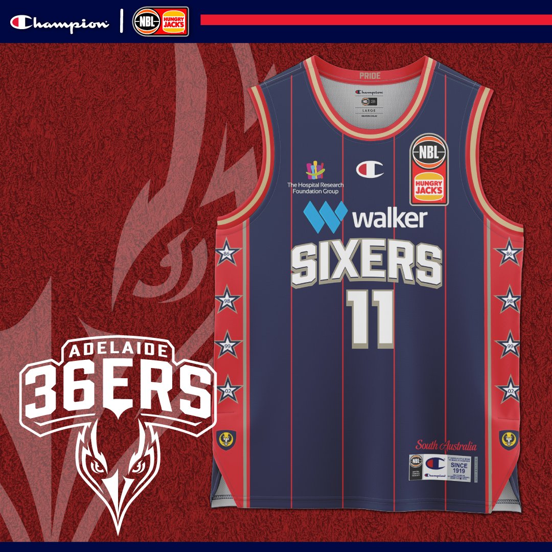
Adelaide - Home jumper with the red lines and emphasis is a hit, one of the best jerseys they’ve done. Next year would love them to ditch the novelty font and use the 36ers text from their actual logo, then roll with that for a good period of time.

Away jumper why did they change the stripe style? Looks a bit crap. Not a fan of the stripe colour either - could improve that.

Brisbane - It’s kinda meh, don’t make a random text logo just for the jersey/merch. Use the much better text from your logo. Was kind of hoping they’d add a bit of the the red and white at the sides to go old school like their training gear. A miss.

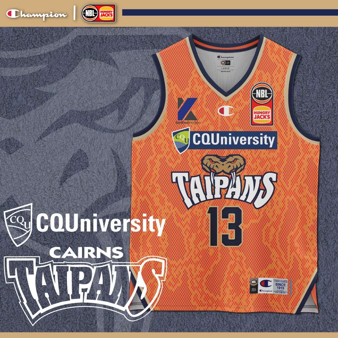
Cairns - I agree with the "shit hot" reference. They’ve nailed home and away jerseys. Don’t change them next year. They’re perfect as they are now.

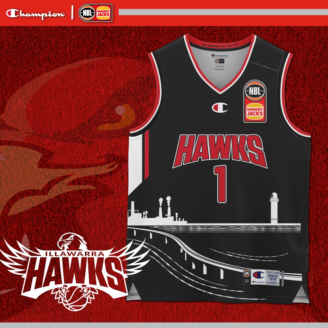
Hawks - I don’t like the silhouette on the home jumper, it looks too much. Looks a tad better on the away jumper.

Melbourne - Love the double blue effect with the added emphasis on the light blue. Use the Melbourne font from their logo and ditch the novelty font and you’re set.

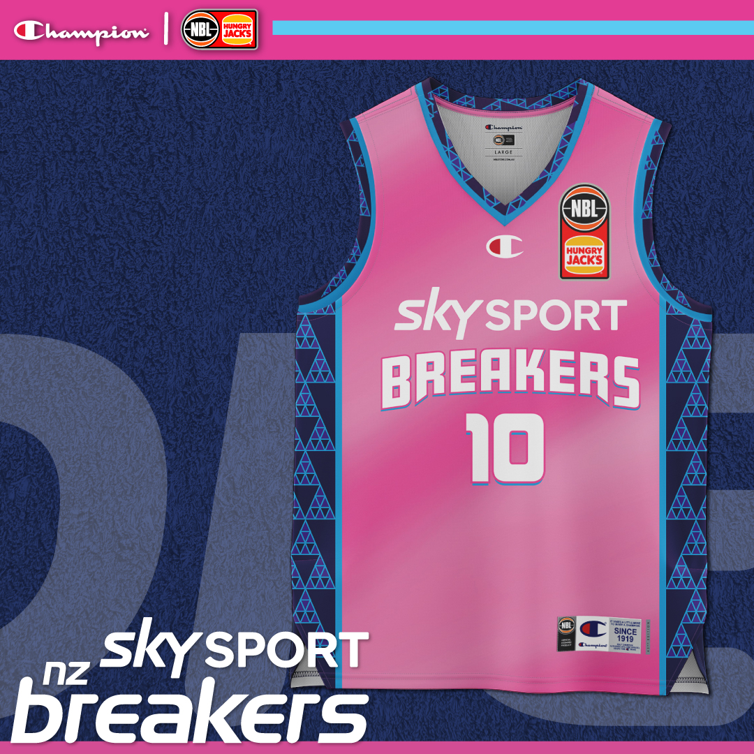
NZ - Not a fan of the sides, love the continuation of the Miami vice colouring anyway, if that’s their style from now on then sweet. Novelty breakers font is better than their crappy logo.

Perth - Looks good, love the indigenous adaption on the sides, doesn’t look too busy. I’d be curious what the Wildcats font from their logo would look like on that top - I think the sharper font would make for a sharper look.

Phoenix - Love it as usual, minor changes, still looks good.

Sydney - Not a fan of the text colour on the home jersey keep it white or go yellow. Should have avoided black for the stripes too.

Away jersey looks much better IMO, the purple stripes and text with yellow borders on white.

I like Sydney’s full logo so much, and the KINGS is solid enough on the logo that I’d love to see it back in the jersey. The full thing. Do it.

Tasmania - Love the alt logo inclusion and the sides are schmick. Big tick.

Away top also looks pretty decent.

Reply #898768 | Report this post


You need to be a registered user to post from this location. Register here.


Close ads
Serio: Tourism photography and videography
Little Streaks - The fun and interactive good-habits app designed especially for kids.

Advertise on Hoops to a very focused, local and sports-keen audience. Email for rates and options.

Recent Posts


.


An Australian basketball forum covering NBL, WNBL, ABL, Juniors plus NBA, WNBA, NZ, Europe, etc | Forum time is: 7:20 pm, Sun 28 Apr 2024 | Posts: 968,026 | Last 7 days: 754